Community Capital Documentation
With a view to providing helpful and clear data about capitals and supporting future research in community developments, we developed a clear documentation for the measures.
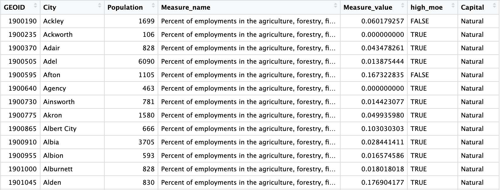
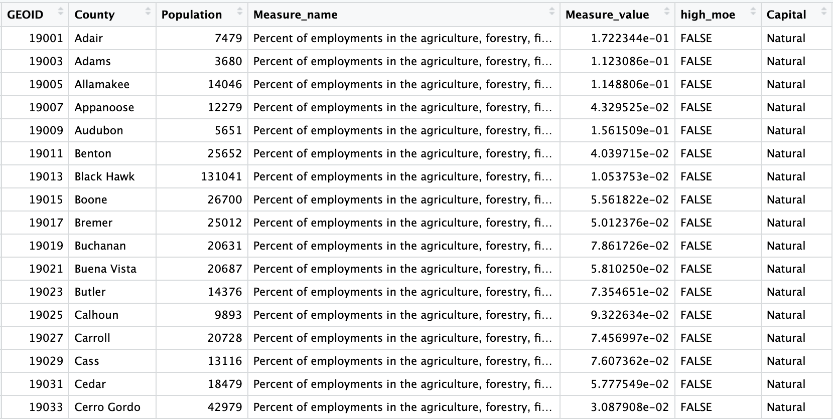
These are the two final datasets we aggregated:
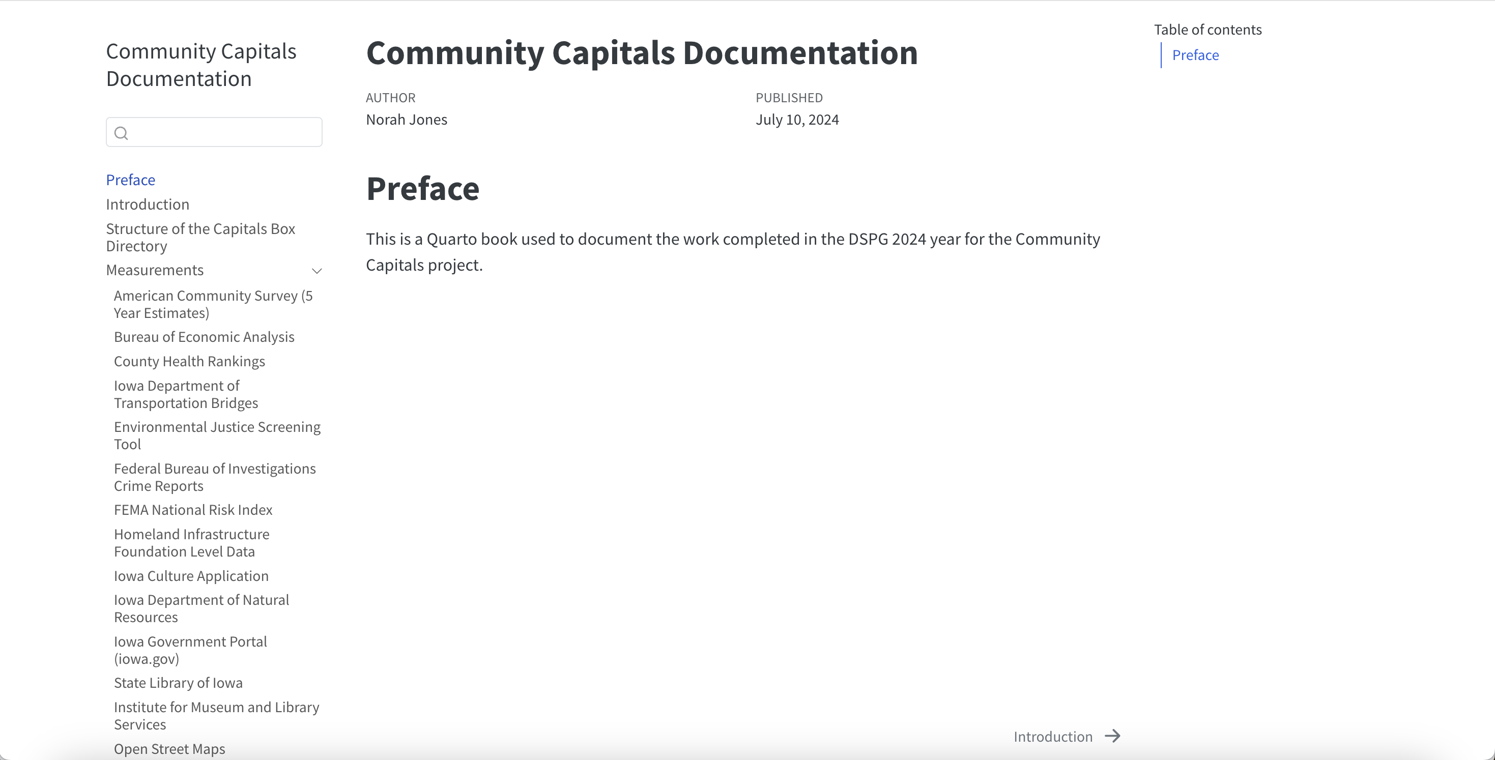
Documentation Book
We are aware that you can only make good analysis when you understand the data.
With that in mind,we created a brief documentation book to help our clients fully understand the data.
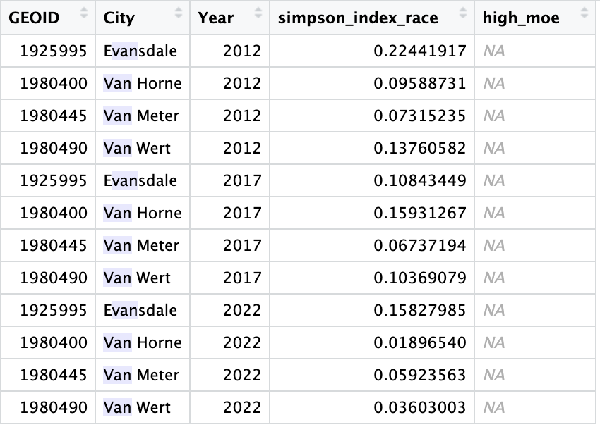
ACS Time Series Data Collection
Next, we decided to explore how measures have changed throughout the time.
We collected data for ACS measures from the 5-year Report survey for the years 2012, 2017 and 2022 to avoid overlapping periods.
Current Objectives
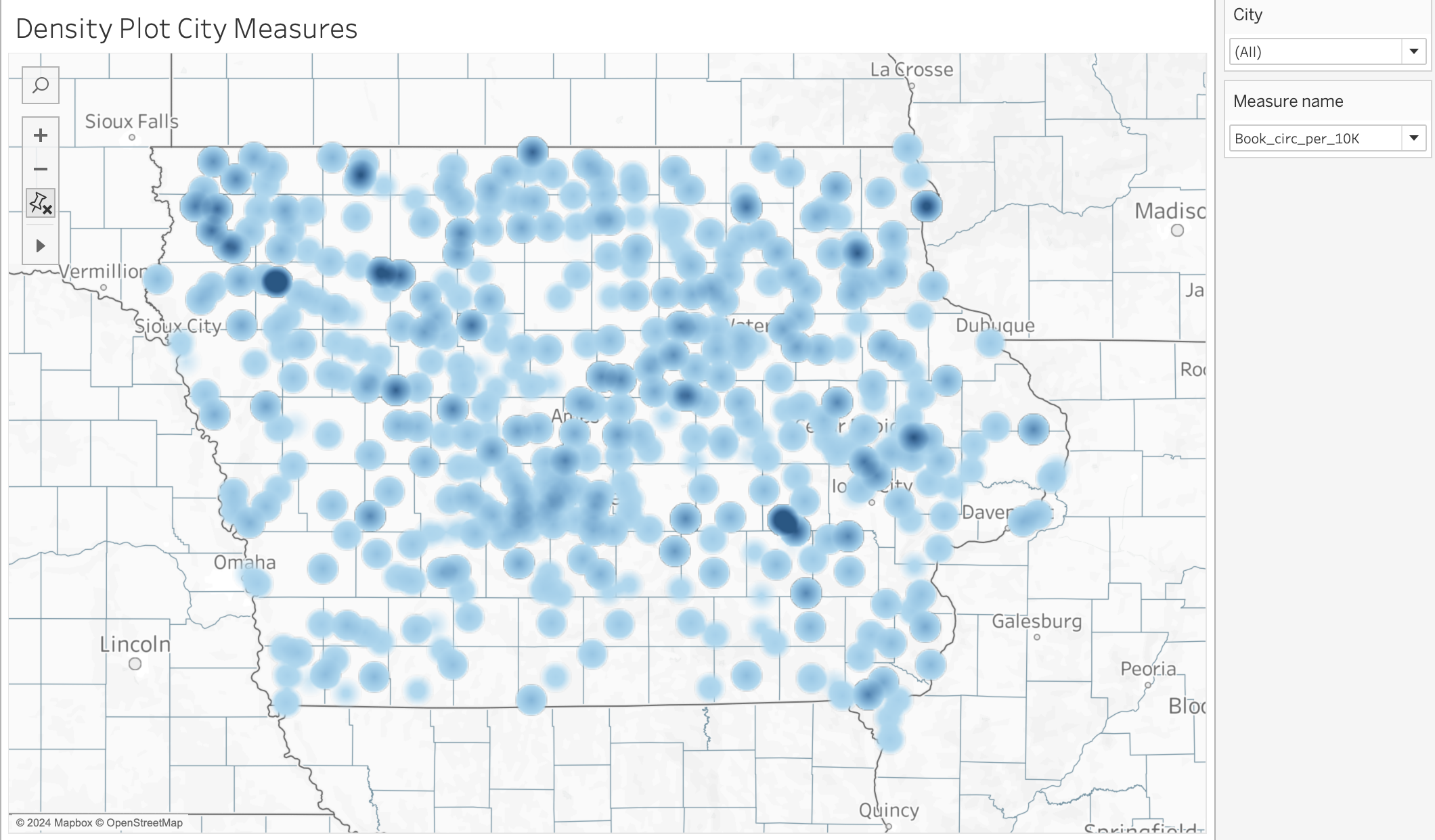
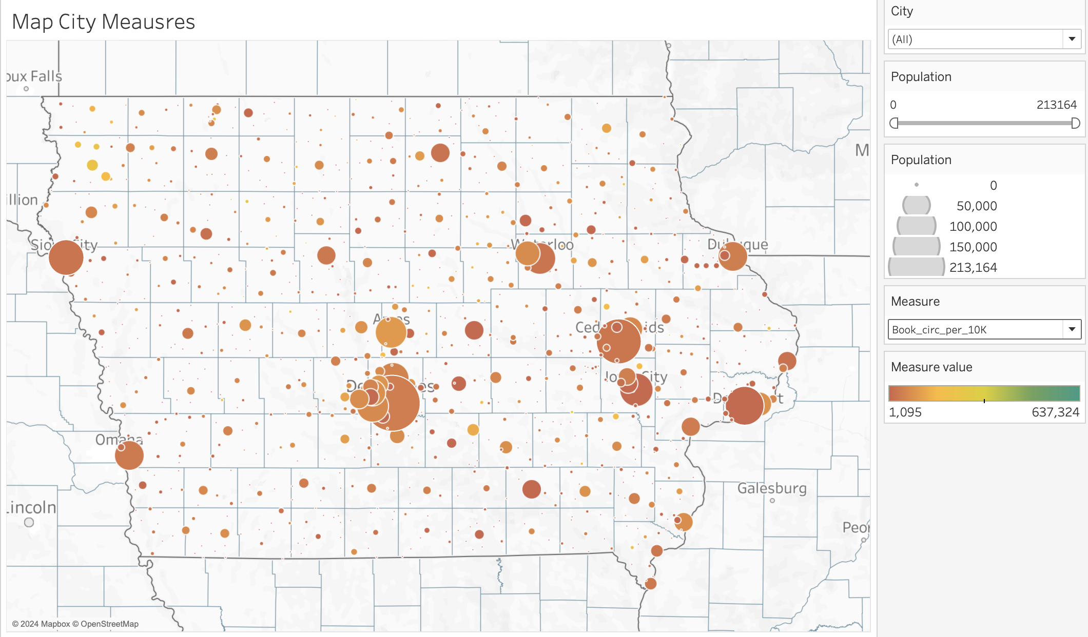
Community Capitals Visualization
Our priority feature is to have tab on our dashboard dedicated to visualizing different capitals for both City and County level. The layout of this tab should include multiple filter tabs such as City/County level, Capital type, and measurements. After the filters, it will display various different graphs like Maps, Boxplot, Bar plots, etc.
Density Plots for City: Places that have higher measure value.
County Measure: County level measure
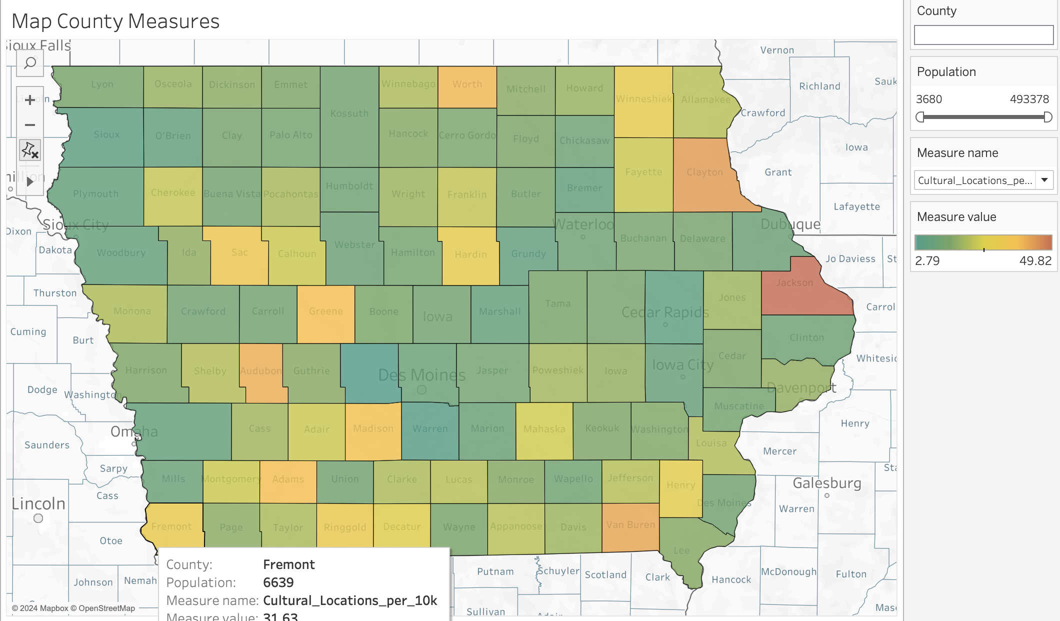
Population based
Measure Correlation
Our next feature will include a dedicated tab for analyzing correlations between various measures from the same or different capitals. This information could be valuable because, for instance, if your community has a high crime rate, understanding which other measures to invest in to potentially increase it can guide better decision-making.
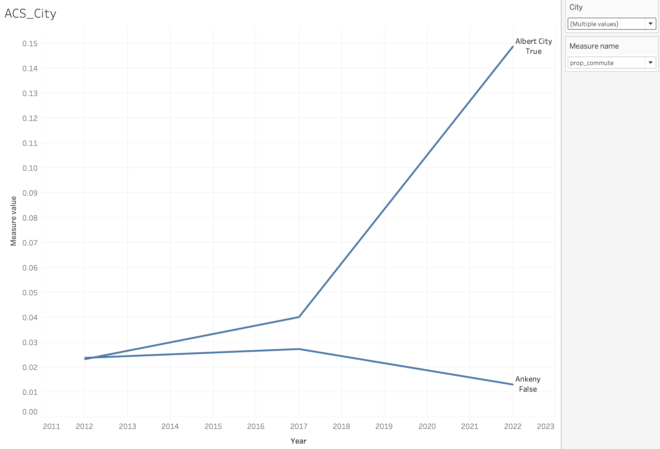
ACS Time Series Visualization
Our final core feature includes a time series visualization of various ACS measures collected from 2012-2022, is to provide a comprehensive view of how these measures have evolved over time. This allows for identifying trends, patterns, and changes for better decision-making.
Our next steps
Our end goal is to have a Tableau dashboard that has the measure exploration, bivariate analysis, and ACS time series plots. We will have tabs that can be used to go between different measures, bivariate plots, and time series plots. We also have worked on event data that we hope to convert to time series plots and include in the dashboard.
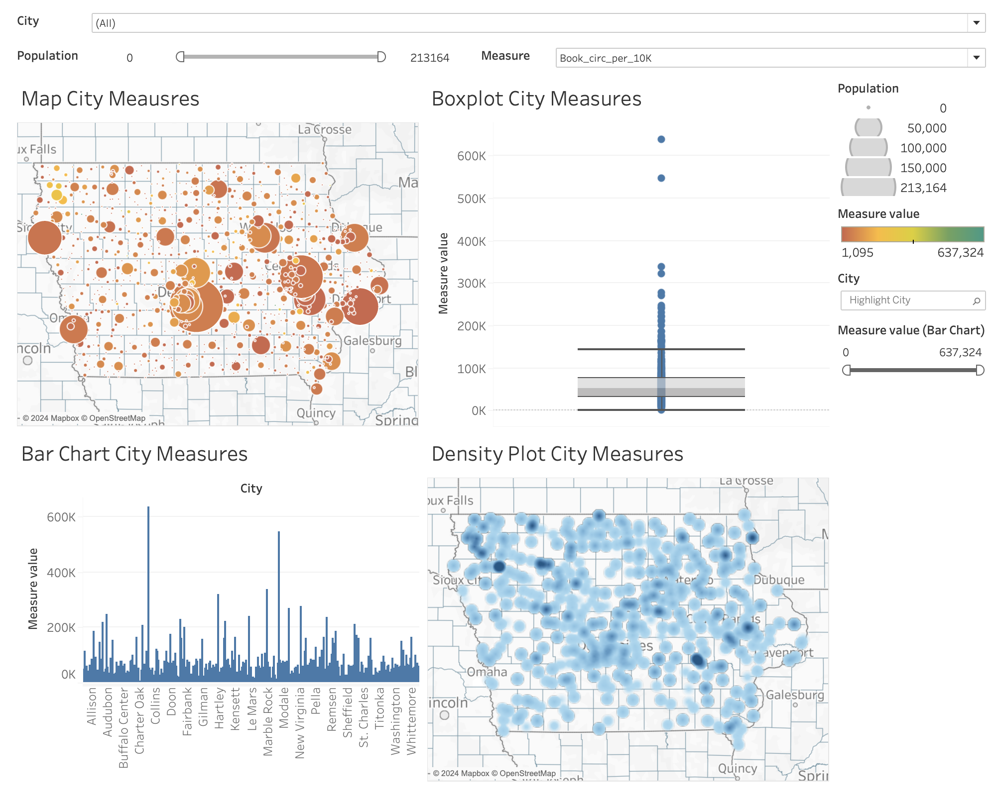
This is an example of what the measure exploration tab might look like. In this dashboard you can choose cities, population, and measure that you want to explore. You can type a city name inside the highlight city filter and it will show you where that city falls on the boxplot and bar chart.
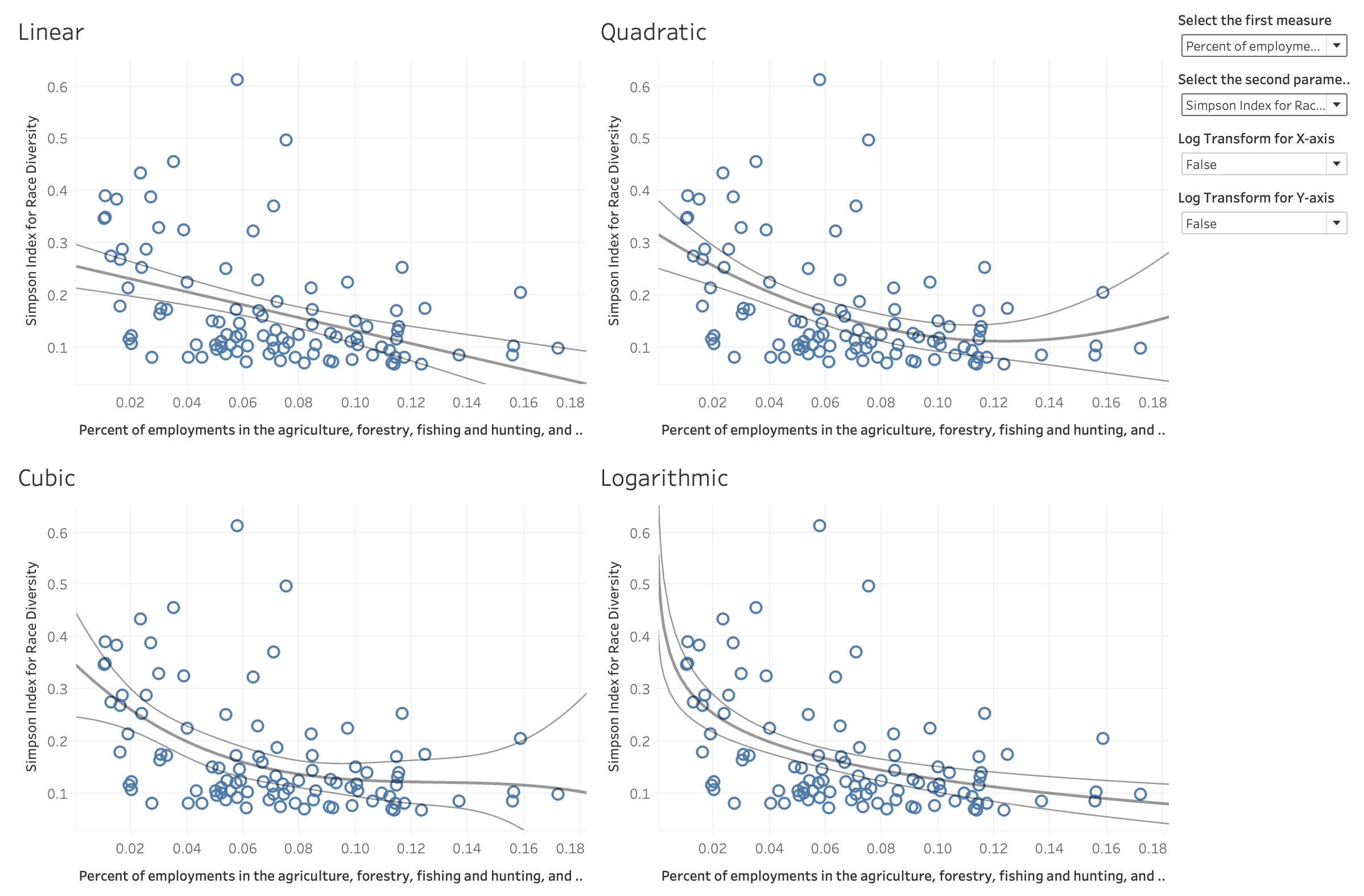
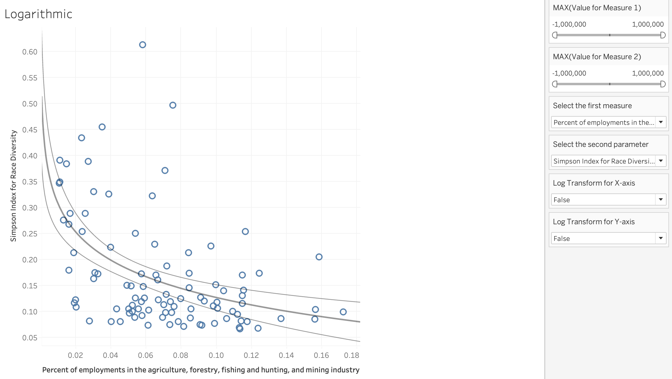
This is an example of what the bivariate analysis tab might look like. In this dashboard you can select the two measure that you want to look at and whether you want to see the log transformation. You can choose if you want to see the log transformation for the x and/or y axis.