Introduction
Understanding Community and Capitals
Before delving into the concept of community capitals, it’s essential to understand what constitutes a community and what we mean by capitals. A community can be understood through several aspects:
- Geographic-based: This includes neighborhoods, towns, cities, counties, etc.
- Organization-based: Communities formed around workplaces, schools, and other organizations.
- Identity-based: Communities linked to one’s hometown, vacation spots, and other personal affiliations.
A healthy community encompasses all three components. It has distinct physical boundaries, serves as a primary location for employment and services, and fosters a strong attachment to the place.
So, what is a capital? Capital refers to assets that are ‘invested’ to generate new resources. Key characteristics of capitals include:
- They can be overused and depleted.
- They must be utilized to grow; otherwise, they depreciate.
- They are embodied in individuals and organizations.
- They function as public goods.
- Generally, having more capital is beneficial, but not always.
Types of Community Capitals
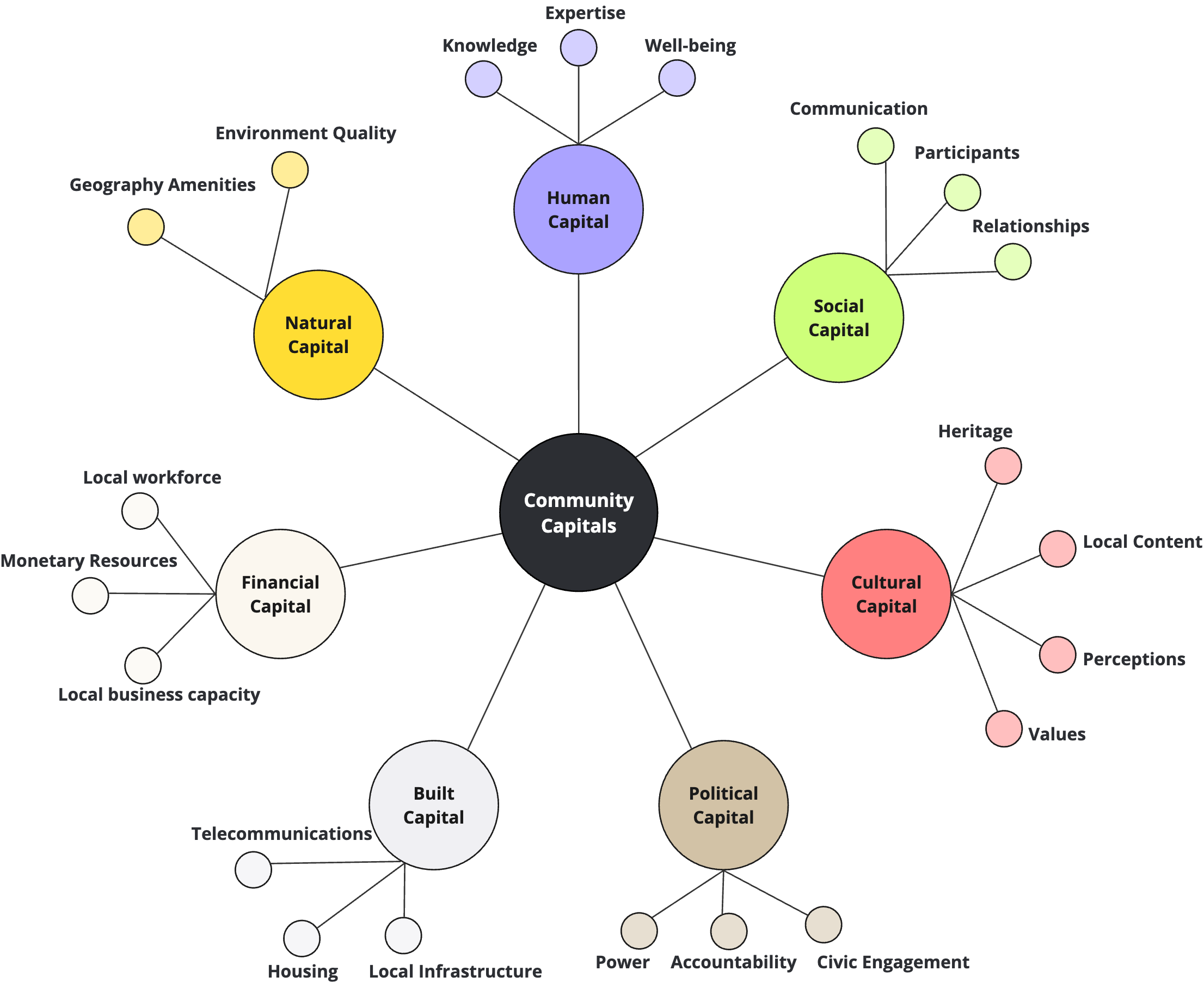
- Natural Capital
- Defined: Landscapes (topography, landforms), Proximities (urban areas, natural amenities)
- Human-managed: Necessary for consideration as capital
- Examples: Soils, water, forests, wildlife, climate, farms, environmental hazards, over-development
- Cultural Capital
- Defined: Understanding society, socialization, material and non-material
- Importance: Maintains social class boundaries, shared but can have subcultures
- Examples: Theater, dance, music, museums, historical sites, bookstores, galleries
- Human Capital
- Defined: Qualities enabling individuals to earn and contribute to their communities
- Properties: Enhances task performance, adds value, leads to higher compensation
- Investment Examples: Education, training, work experience, personal learning, healthcare
- Social Capital
- Defined: Networks, trust, norms, enhancing societal efficiency
- Foundations: Trust, norms, sympathy, attachment, networks
- Uses: Community engagement, public goods investment, resource acquisition
- Dangers: Conformity, exclusion of outsiders
- Types:
- Bonding: Internal networks, strong ties (race, class, gender)
- Bridging: External networks, weak ties (diverse backgrounds)
- Political Capital
- Defined: Influence on community priorities, resource distribution, rule enforcement
- Properties: Formal (elected), Informal (non-elected)
- Examples: Laws, regulations, community power networks
- Built Capital
- Defined: Tangible structures and infrastructure supporting other capitals
- Properties: Exclusive (paid access), Inclusive (open access)
- Examples: Business equipment, schools, health facilities
- Financial Capital
- Defined: Monetary tools convertible to other capitals (savings, income, loans)
- Properties: Creates human and built capital through investment
- Investment Examples: Direct (stocks), Indirect (education)
All seven of these capitals are crucial for a community to thrive. However, for our project we focused on Built, Natural, Social, and Cultural capitals. These capitals are more challenging to measure and find data sources for. In contrast, Financial Capital can be easily quantified using metrics like median household income, the number of businesses, etc. On the other hand, measuring cultural, built, social, and natural capitals are much more complex and less straightforward.
Questions:
What do the community capital indicators tell us about a community?
How well do the identified indicators tell us about the condition of a community in relationship to the community capitals?
Events Database
In addition to our Community Capitals project, we have also been developing an Event Database. The aim of this project is to compile significant events that have occurred in Iowa over the years across various sectors. Example datasets we have worked with include FEMA’s natural disasters, economic development projects, nursing home closures, Iowa school district changes, and job layoffs. The purpose of this database is to provide a comprehensive resource for analyzing historical events in Iowa, enabling better-informed decision-making and strategic planning for the future.
Importance of Data-Driven Decision-Making
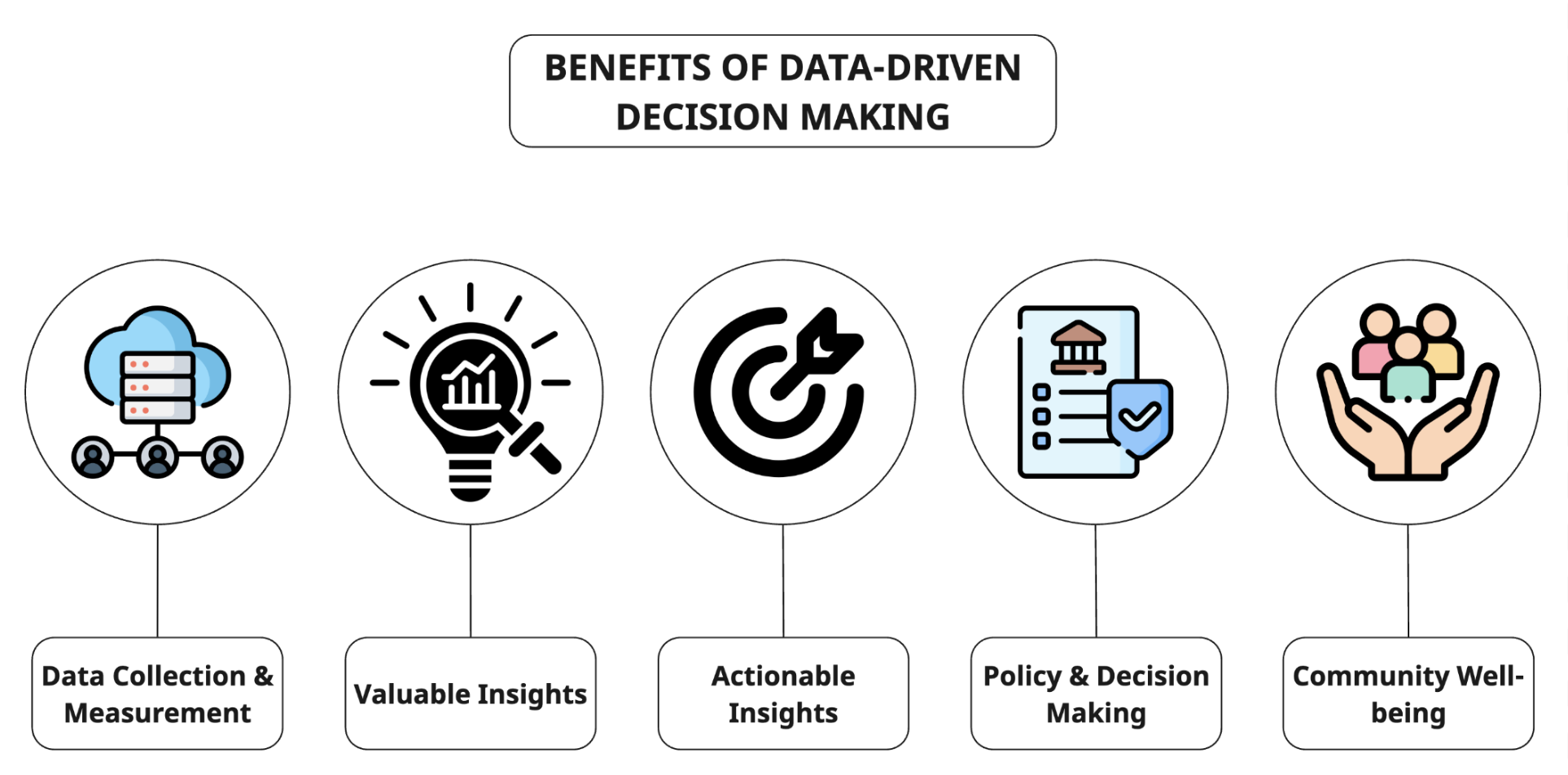
- Data Collection and Measurement
- Diverse Measures: Collecting a wide range of data points for each type of capital.
- Accuracy and Comprehensiveness: Ensuring the data collected is both accurate and comprehensive to capture the true state of each capital.
- Valuable Insights
- Strengths and Weaknesses: Identifying the strengths and weaknesses of a community through detailed analysis of the data.
- Holistic Understanding: Gaining a holistic understanding of the community by considering all types of capitals.
- Actionable Insights
- Strategic Planning: Using the insights gained to guide strategic planning efforts.
- Resource Allocation: Informing resource allocation to address identified needs and opportunities.
- Policy and Decision-Making
- Informed Decision-Making: Enabling policymakers to make informed decisions based on accurate data.
- Organizational Planning: Assisting organizations in planning and executing community-focused projects.
- Community Well-being
- Sustainable Development: Promoting sustainable development by ensuring that all aspects of community well-being are considered.
- Resilience Building: Fostering resilience in communities by addressing diverse capital needs and strengthening overall community infrastructure.
Our Project
Project Methodology
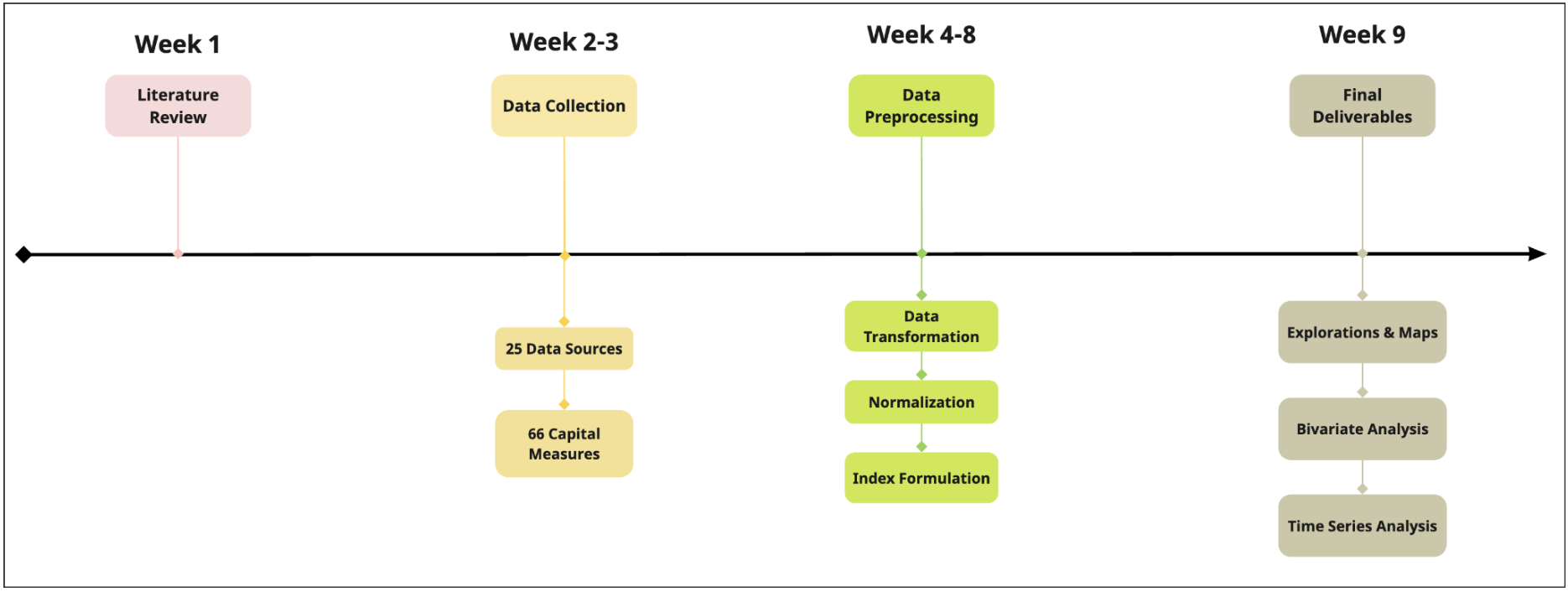
Initial Research
In the first few weeks, we focused on understanding community capitals by reviewing previous research. This helped us identify key questions and measures that are crucial for assessing community resources.
Data Collection and Selection
Next, we sought reliable data sources and carefully selected influential measures contributing to community capitals. This process resulted in 25 raw data sources and 66 capital measures (for capitals alone), which required significant effort to process, transform, and normalize into a meaningful format.
Final Deliverables
To support our clients, we created three comprehensive dashboards:
- Explorations & Maps: Provides a clear view of the spatial distribution of resources.
- Bivariate Analysis: Offers insights into the correlations between different measures.
- Time Series Analysis: Displays trends over time, showing the rise and fall of resources.
These dashboards collectively enhance the understanding of community capitals and aid in informed decision-making.
Technologies
Programming Languages
Python and R are well-known for their robust capabilities in data analysis, visualization, and preprocessing. Both languages offer extensive libraries and frameworks that facilitate efficient data acquisition, manipulation, and presentation, making them ideal for comprehensive data-driven projects.
Packages
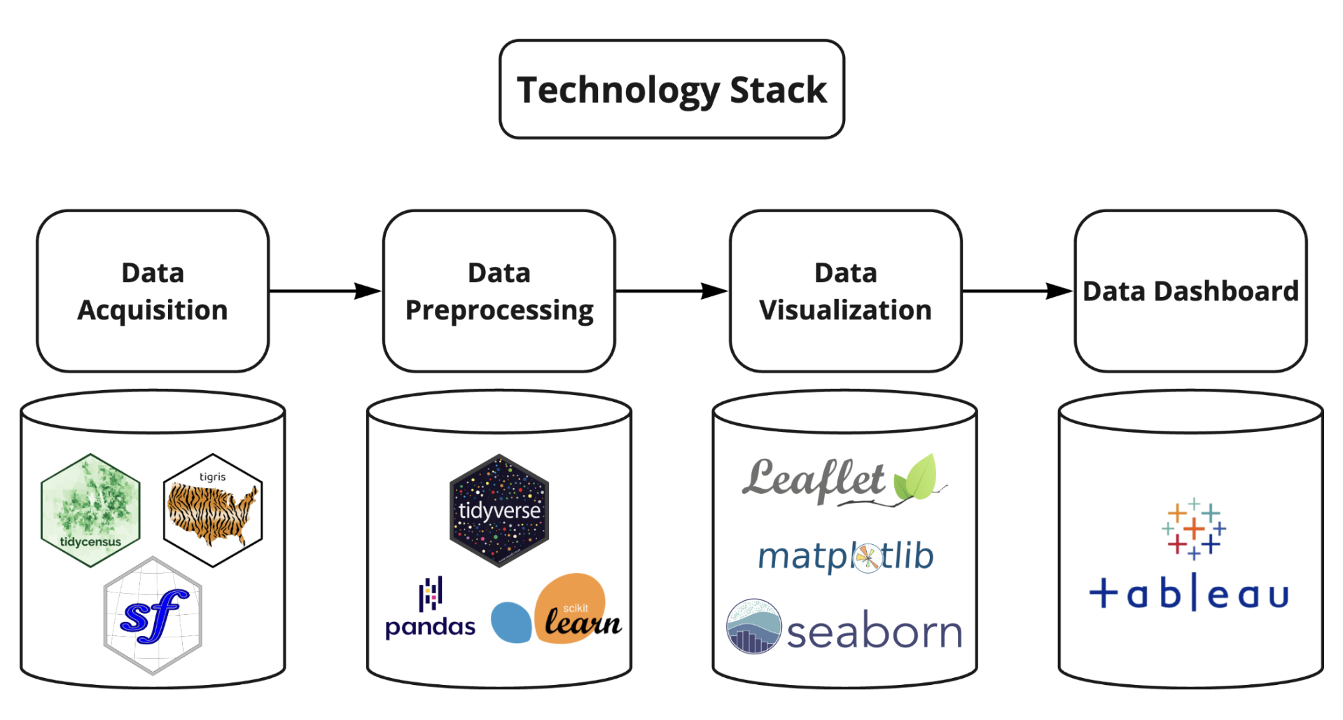
The packages we used can be categorized into three key areas: Data Visualization, Data Acquisition, and Data Preprocessing. Each category encompasses specific libraries and tools essential for our project.
- Data Visualization
- Leaflet: An open-source JavaScript library for interactive maps. In our project, Leaflet is used to create interactive spatial visualization to understand how capitals are distributed across Iowa. For example: distribution of museums, monuments, etc.
- Matplotlib: A comprehensive Python library for creating static, animated, and interactive visualizations in Python. It is highly customizable and works well with data in various formats.
- Seaborn: A Python visualization library built on top of Matplotlib, Seaborn offers a high-level interface for creating attractive and informative statistical graphics. Both Matplotlib and Seaborn were primarily utilized for visualizing categorical and numerical data, rather than maps or interactive graphs. These libraries were particularly useful for generating quick and straightforward insights. For instance, they allowed us to easily visualize the proportion of obsolete or deficient bridges compared to the total number of bridges within a county.
- Data Acquisition
- Tidycensus: Designed to help R users get Census data that is pre-prepared for exploration within the tidyverse, and optionally spatially with sf. It was often used to fetch American Community Survey data such as number of single-parent households.
- Tigris: An R package that allows users to directly download and use TIGER/Line shapefiles. It was used to fetch spatial locations of different Iowa cities and counties for visualization.
- sf: An R package supports for simple features, a standardized way to encode spatial vector data. It is used to extract the intersection of two areas (e.g: a long stream across multiple county) and calculate spatial parameters, including lengths and areas, etc.
- Data Preprocessing
- Tidyverse: An R package for data manipulation and analysis. It was widely used across the Community Capital project to handle and transform data into the expected format.
- Pandas: A powerful data manipulation and analysis library for Python, offering data structures and operations for manipulating numerical tables and time series. It excels at transforming raw datasets into structured and usable formats, making it indispensable for data cleaning and preprocessing tasks.
- Scikit-learn: A Python module integrating a wide range of state-of-the-art machine learning algorithms for medium-scale supervised and unsupervised problems. In our project, it was primarily used for feature scaling to ensure consistent feature values, enhancing the accuracy of visualizations and analyses. Scaling was crucial as we dealt with multiple datasets and features that had varying numerical ranges.
Data Sources & Measures
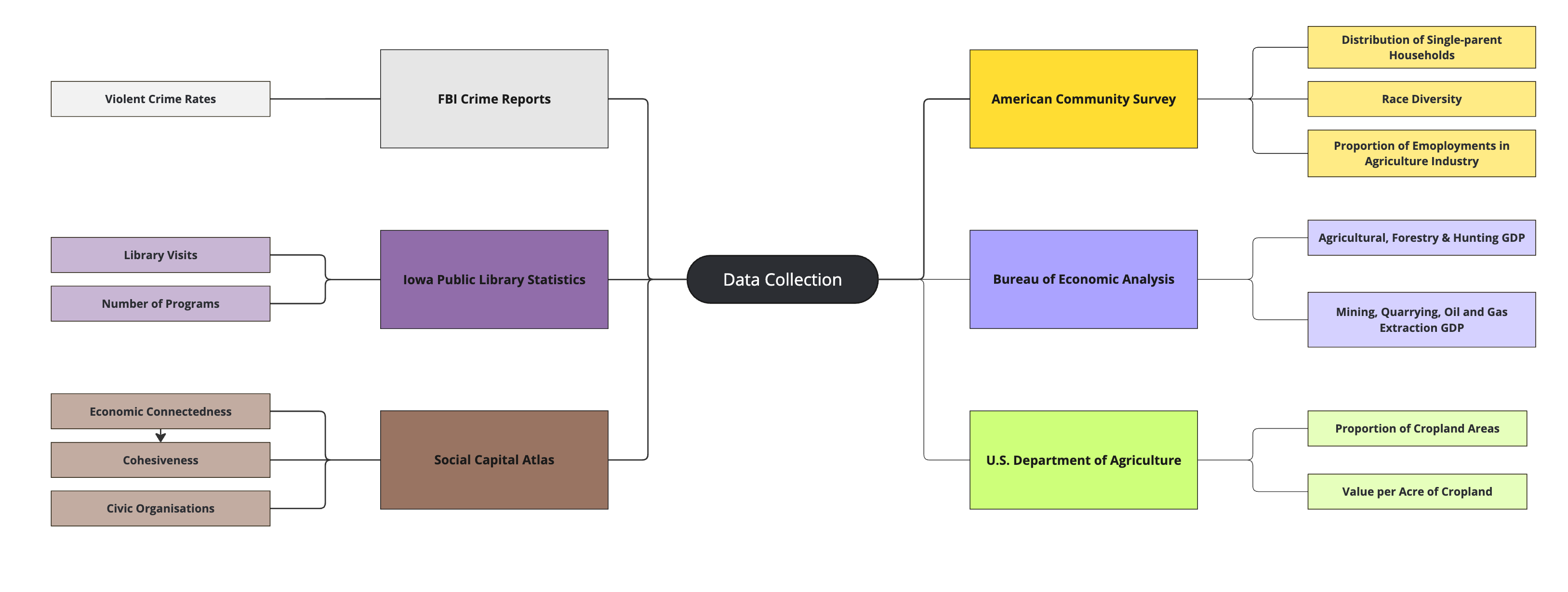
Other Sources: This reference links to the full sources: Data Sources & Documentation.
Data Processing
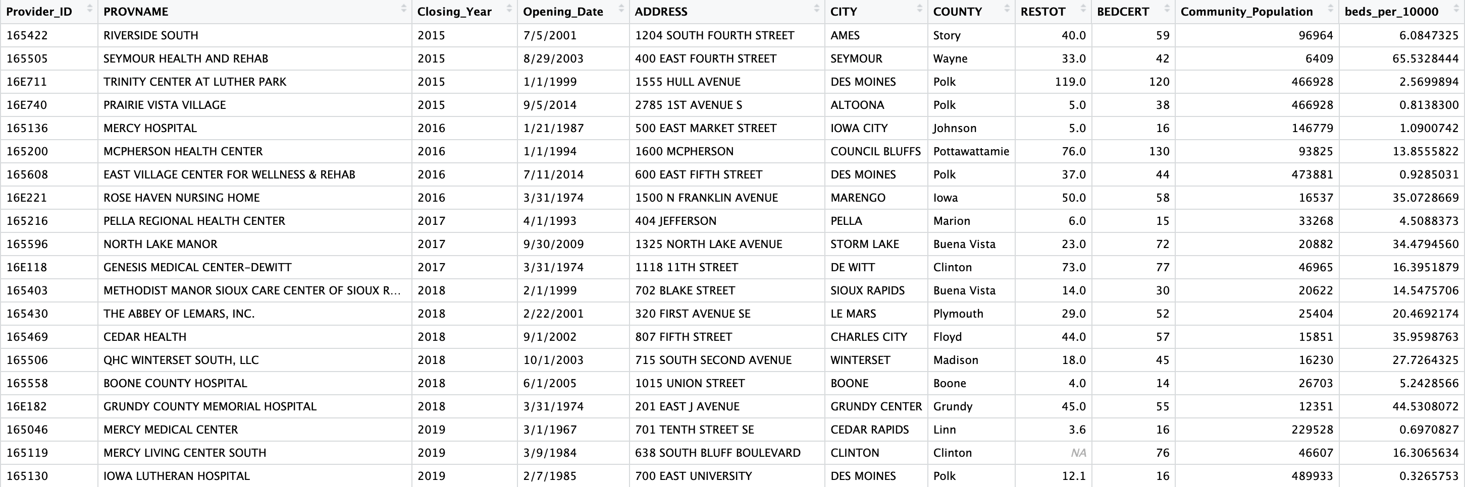
The images and datasets shown below are only for illustrations of different data processing steps in our project.
Lack of Reliable Data
Challenge: For ACS city-level data, most cities had very few population, resulting in high margin of errors in a lot of measures.
Resolution: To this point, the only good resolution for the lack of data was to use county-level data which significantly cutting down the margin of errors. For city-level data, we created an indicator for high/low margin of errors.
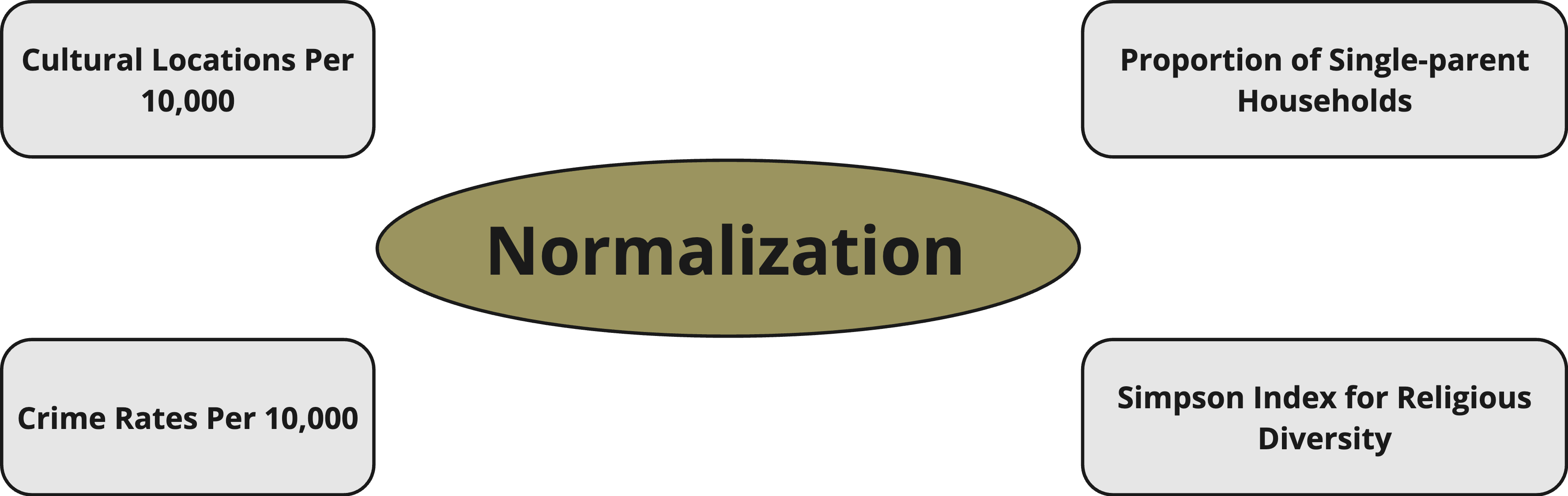
Data Transformation
Our data for different measures came in different ranges and format. We needed to transform our data into a meaningful format that could be easily used in different processes of the project as well as scale and normalize the data to decrease the effect of population differences.
We are clearly aware that there are differences in population sizes among cities and counties. Therefore, in order to normalize our data, we took the proportion with respect to the population sizes, formulated meaningful index and calculated the respective measure.
The preprocessed datasets shown below has more than 15,000 rows and 80 columns in each. After processing missing data, handling mistyped value, transforming the data into correct format and merging tables together, we achieved a single formatted dataset.
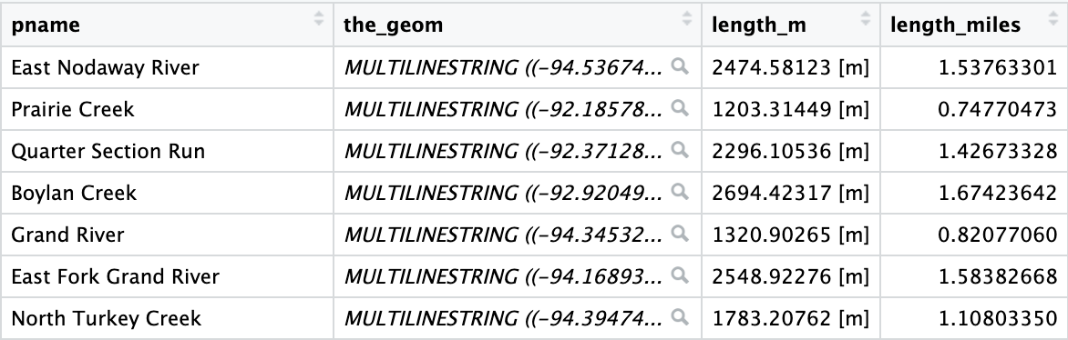
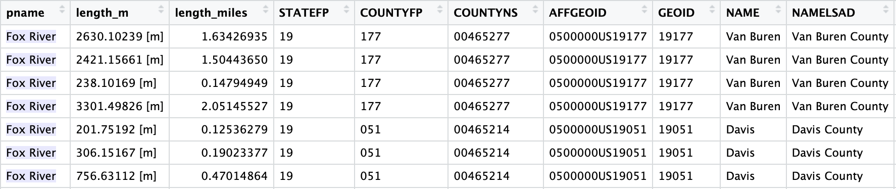
For spatial data, we needed to utilize R packages such as tigris and sf to gauge and extract the areas, lengths and locations of different objects in Iowa. The images below showed the stream lengths after processed. We also did some processing to extract the intersection of the streams among counties to see where they are lying.
Fun fact: A lot of streams have different parts and their parts lying in different counties.
Diversity Index Formulation
For some measures such as race and religious diversity, we formulated a Simpson Index to gauge the “diversity” of communities.
Interpretation: The chance of picking two random individuals that have different race or beliefs.
Formula:
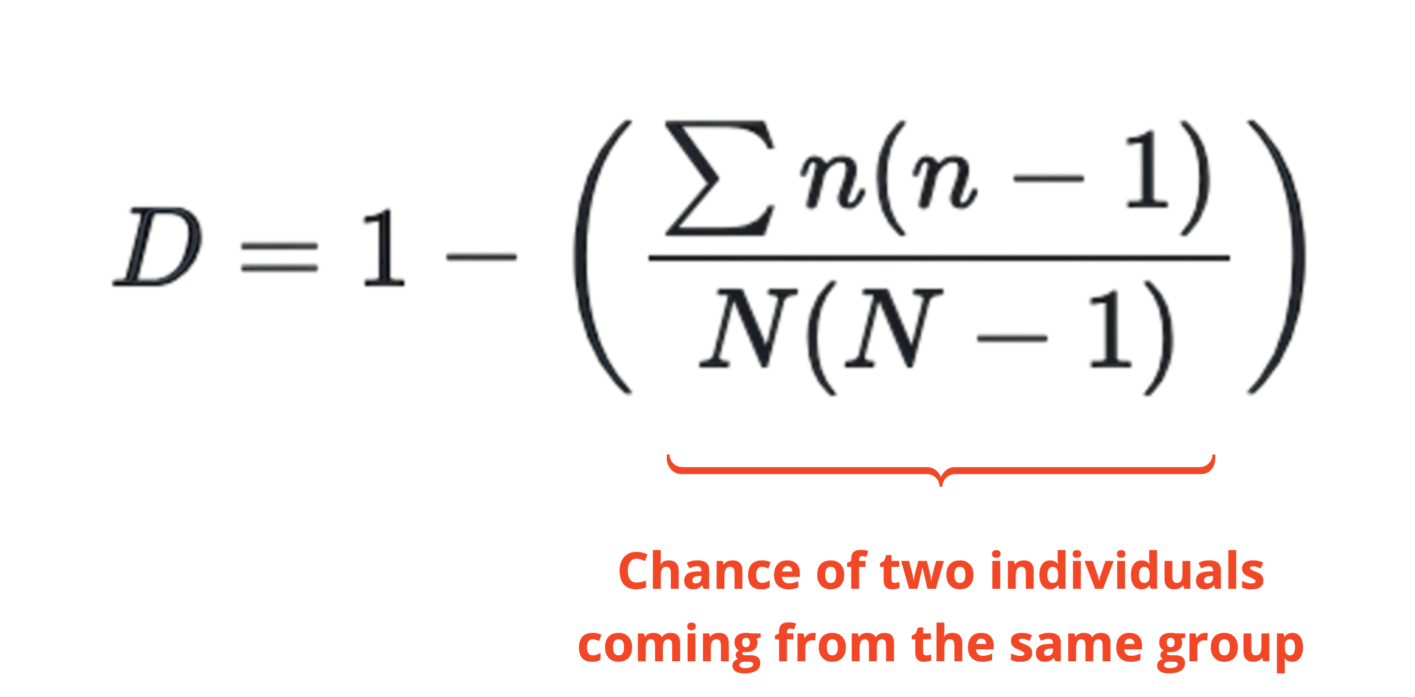
Explanation: \(\frac{n(n-1)}{2}\) is the number of pairs in the same group and \(\frac{N(N-1)}{2}\) is the number of pairs among all individuals, so we take the sum of the number of pairs within groups divided by the total number of pairs.
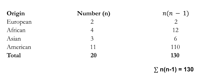
\[D = 1 - \left( \frac{\sum n(n-1)}{N(N-1)} \right) = 1 - \left( \frac{130}{20(20-1)} \right) = 0.3421\] Meaningfully, there is a chance of 0.3421 to randomly select two individuals of different origins.
Challenges
With such a lot of data sources and measures, our challenges mostly lie in the data preprocessing.
1. Learning New Technologies: We needed to become proficient in new languages such as R and its associated packages, particularly for handling datasets and creating helpful visualizations. Our initial weeks of training on DataCamp significantly helped us get up to speed and positioned us better for the project’s demands.
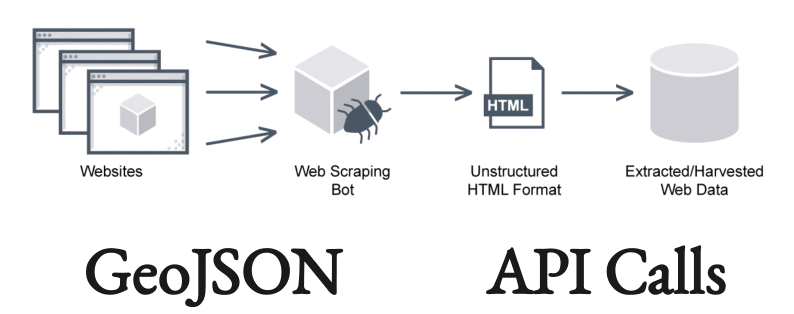
2. Data Collection: Gathering measures for Built, Natural, Cultural, and Social capitals was already challenging but finding reliable data sources for them was even more difficult. We faced additional hurdles such as web scraping, dealing with datasets in various formats like geojson, and making API calls.
3. Feature Engineering: In data science, feature engineering involves transforming or creating new features from existing columns. This process demands a deep understanding of the dataset and precise calculations. For instance, in our events database project, we needed to create columns for Simpson index for diversity or ‘event_magnitude’, which is used to summarize the impact of specific events. This task sometimes required standardization, formula creation, and intuitive weighting.

Tableau Dashboard
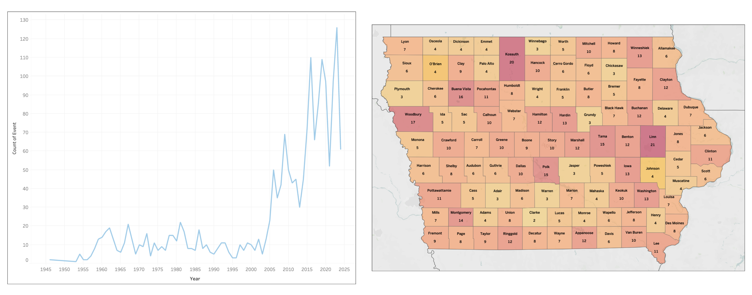
Event Database
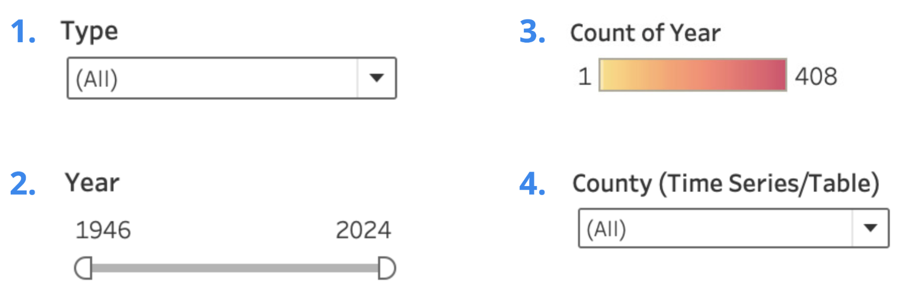
The Event Database Dashboard has three main components: a map to visualize the count of events within each county from 1946 to 2024, a time series line plot to track event counts over the years, and a table detailing the specific events and their information. Users can filter the data by event type (e.g., natural disasters, employment layoffs), adjust a year slider ranging from 1946 to 2024, and select a specific county.
Dashboard Filters
Facility Closures(Nursing homes, Schools, etc.)
ACS Time Series Analysis
We have developed a dashboard specifically for visualizing measures from the American Community Survey (ACS) data, one of the primary sources for our Community Capitals project. The ACS dashboard allows for easy access to data across different time periods (2012-2022), providing a consistent and convenient way to analyze trends over time. This dashboard aims to facilitate comprehensive insights into community changes, supporting informed decision-making and strategic planning.
Dashboard Filters
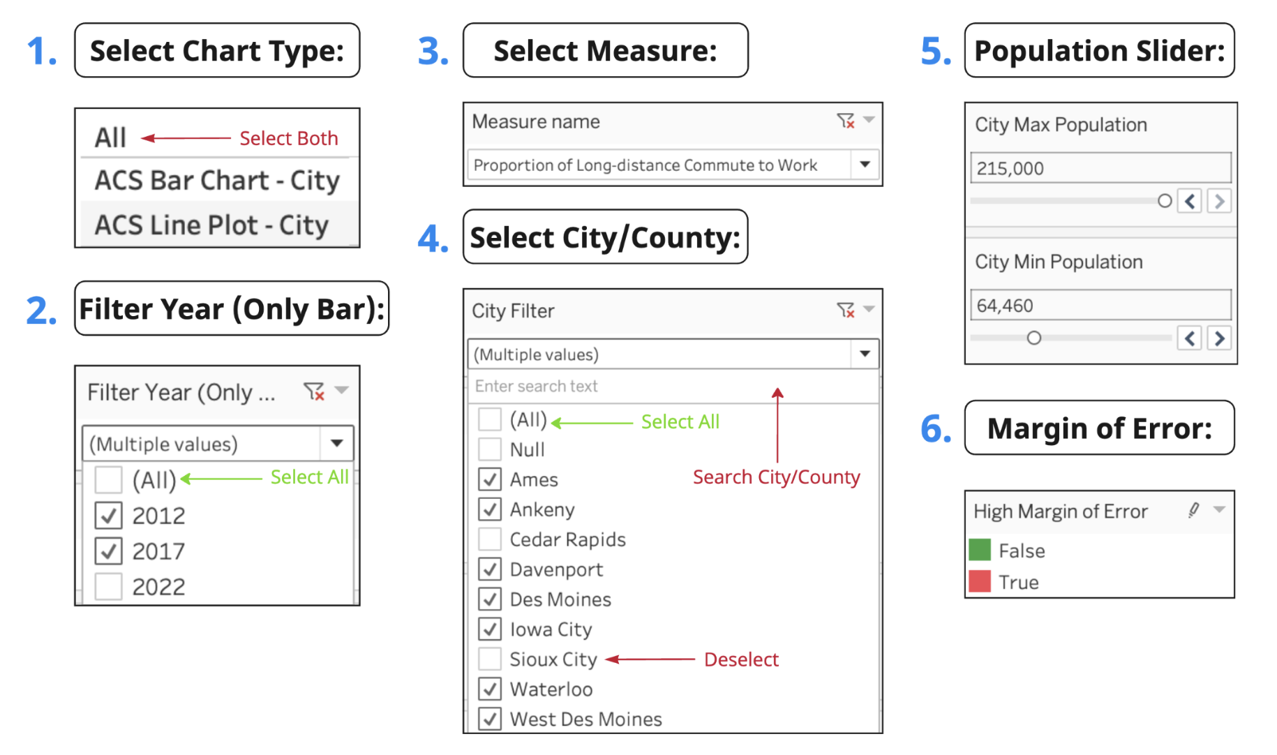
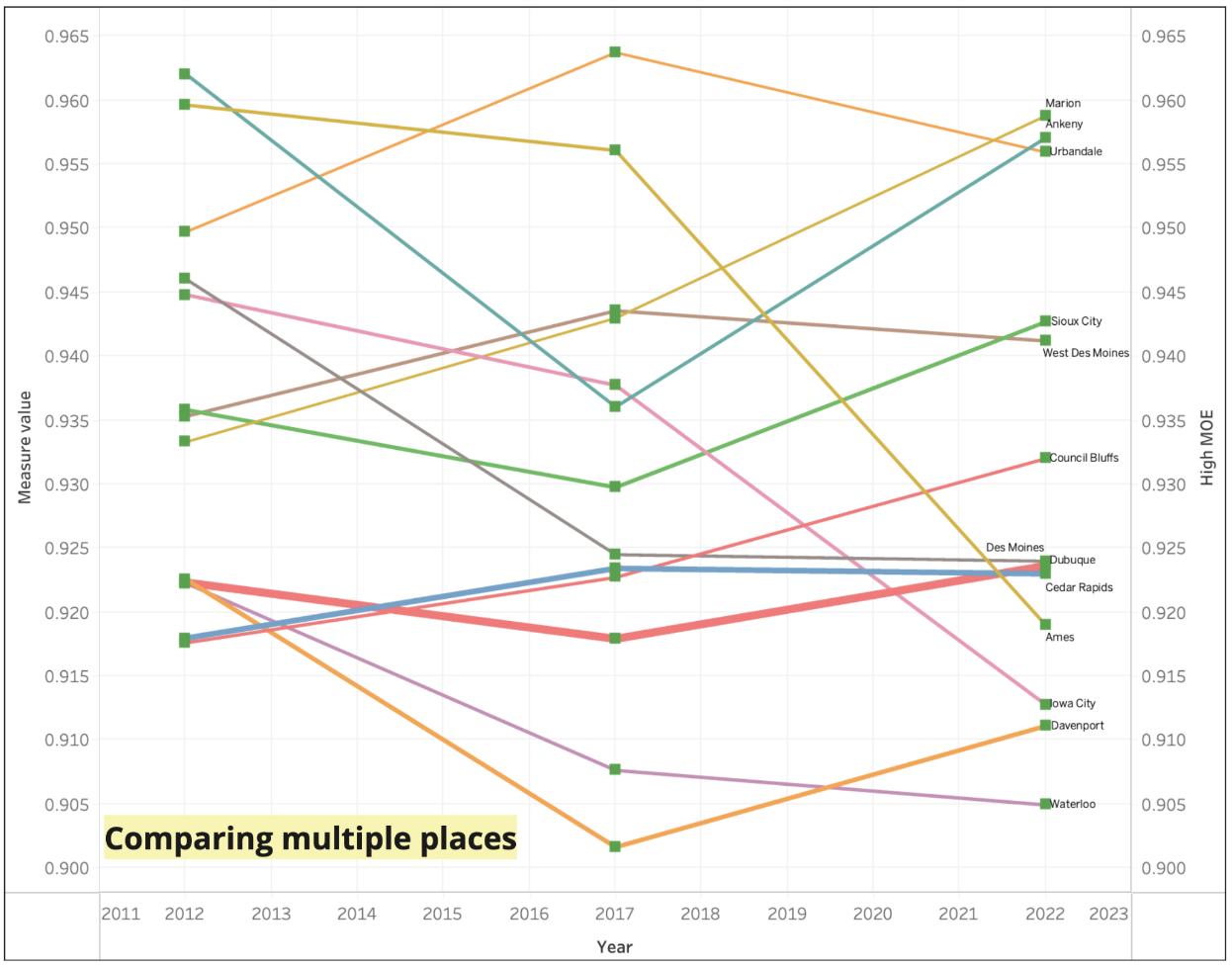
ACS Line Plot
The purpose of using a line plot is to observe how ACS measure values have fluctuated over the years and to compare trends across multiple cities over time. Unlike a bar chart, a line plot can effectively display data from 20-30 counties while maintaining visual appeal. This makes it an excellent tool for identifying patterns and drawing meaningful insights from complex datasets.
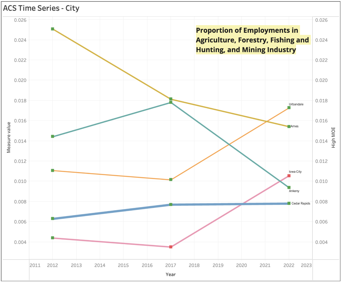
The graph below displays the trend line for measure ‘Proportion of Employment in Agriculture, Forestry, Fishing and Hunting, and Mining Industry’ across various cities. The data reveals fluctuations in employment proportions over time. Notably, Ames and Ankeny exhibit a decline, whereas Iowa City and Urbandale show an increase over the past decade. However, it’s important to note that the margin of error for Iowa City in 2017 and 2022 is high, which suggests that the observed increase in these years might not be entirely accurate.
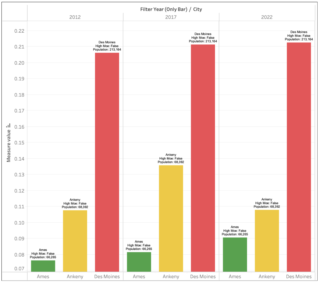
ACS Bar Chart
The bar chart is crucial for comparing values across a few counties, as illustrated in the graph below. By displaying data for three cities—Ames, Ankeny, and Des Moines—across three years (2012, 2017, 2022) for the measure ‘Proportion of Single-Parent Households’, it effectively highlights trends and differences over time. This visualization allows users to easily identify patterns and make informed decisions based on the data. Furthermore, the ability to customize the chart by filtering specific years and adding more cities enhances its flexibility and utility, enabling a more tailored analysis.
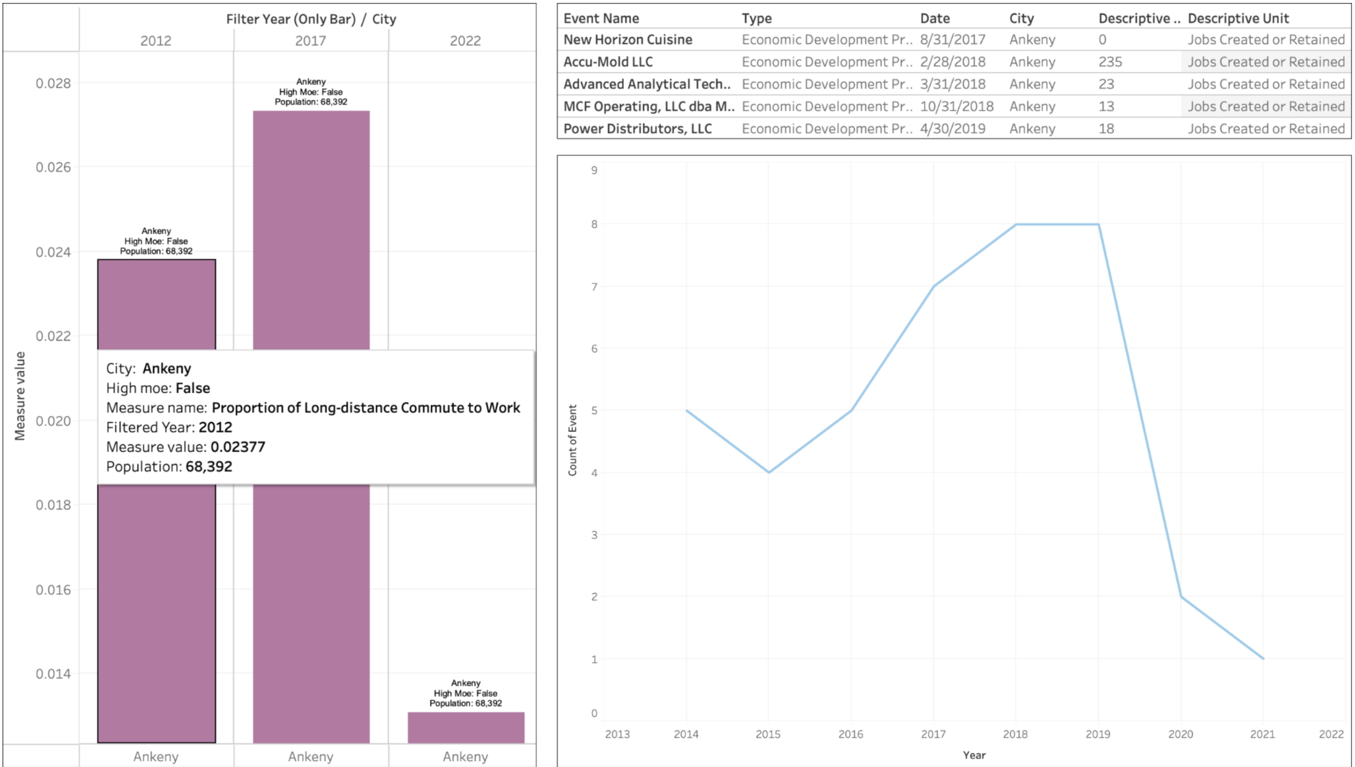
Interesting Findings with ACS and Events
You don’t have to treat each dashboard as individuals; you may explore different dashboards and their measures to identify patterns or interesting findings. For example, by examining the Proportion of Long-distance Commute to Work measure from our ACS dashboard, we observed a significant decrease in commute times for ‘Ankeny’ post-2017. Without local job creation or economic development, such a decrease in commute time would be unusual. However, upon reviewing the economic development projects in our Events database, we found several projects initiated in Ankeny after 2017, which likely contributed to the reduced commute times. Local economic development has played a significant role; Ankeny has experienced substantial investments in new commercial and residential projects. For example, in 2022, the city permitted over $528 million in new construction, which includes both commercial and residential developments. This level of investment has been consistent over the past few years, indicating a sustained effort to improve local infrastructure and create jobs within the city itself. These developments likely provided more employment opportunities locally, reducing the need for residents to commute to Des Moines or Ames (Ankeny Economic Development). Additionally, the growing popularity of remote work in recent years must also be considered as a potential factor.
Explorations & Maps
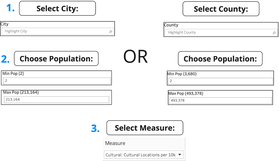 Capital Measures Dashboard Filters
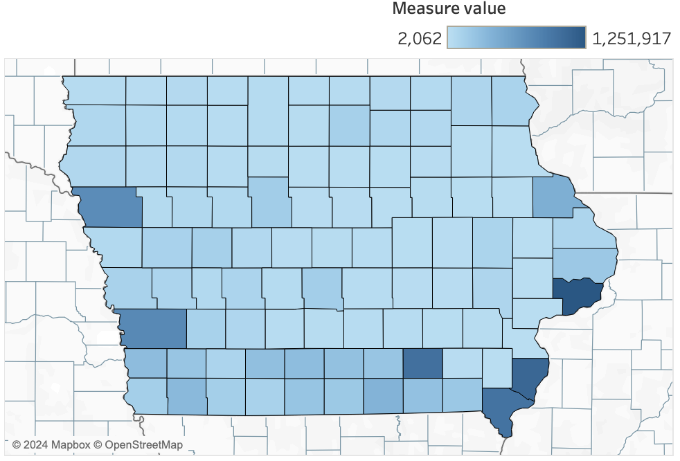
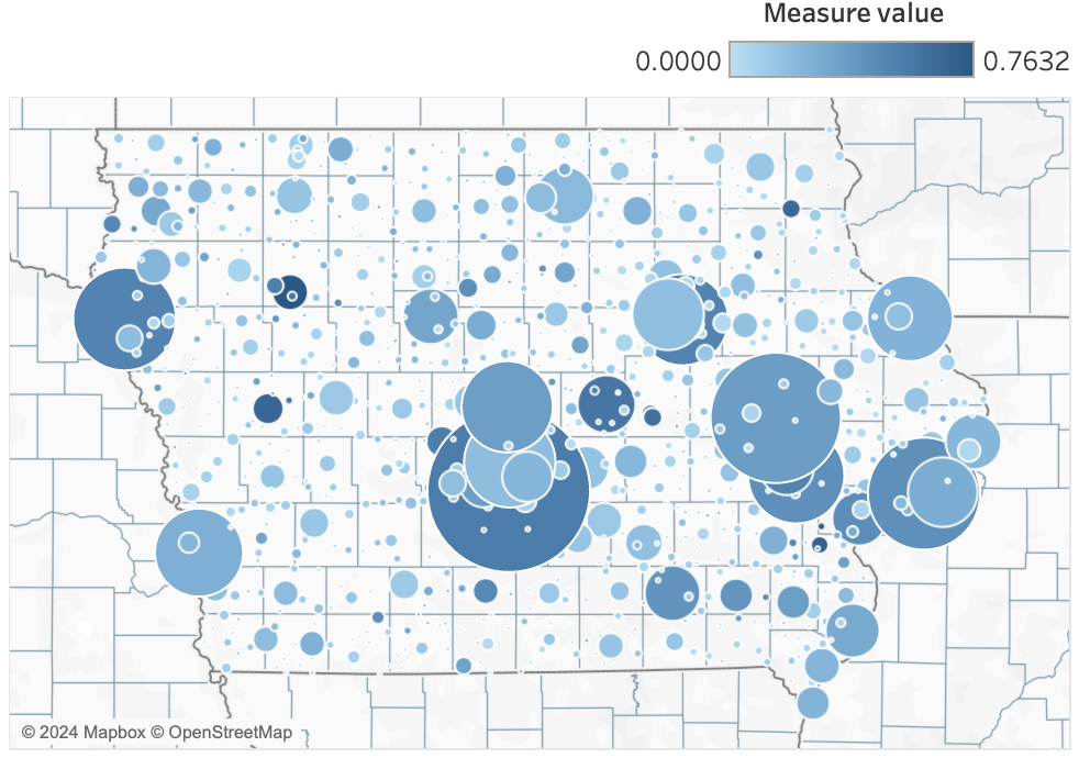 Simpson Index Race Diversity
This map is of the Simpson Index Race Diversity. The circle size represents that population size of each city. The cities with the highest measure values are dark blue. Storm Lake, Conesville, Columbus Junction, and Denison have the highest measure values. We believe this is because these cities have big distribution plants. The plants offer an employment opportunity for a diverse workforce.
 Heat Wave Expected Annual Loss
This map shows the expected annual loss in dollars due to heat waves. Certain areas could have higher expected annual loss when there are large urban areas which have more intense heatwaves due to the urban heat island effect. If a certain county has a vulnerable population, for example the elderly, young children, or people with health conditions it can lead to people paying expensive medical bills and a higher need for healthcare services. That can increase the expected annual loss in a community.
Bivariate Analysis
We have developed a dashboard specifically for visualizing measures from the American Community Survey (ACS) data, one of the primary sources for our Community Capitals project. The ACS dashboard allows for easy access to data across different time periods (2012-2022), providing a consistent and convenient way to analyze trends over time. This dashboard aims to facilitate comprehensive insights into community changes, supporting informed decision-making and strategic planning.
 Analysis Dashboard Filters
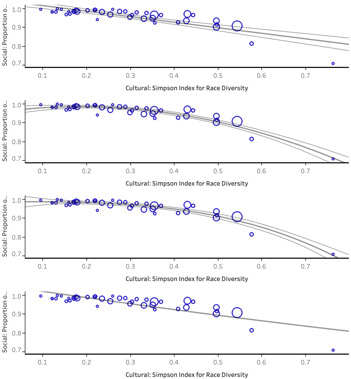 Models of Simpson Index Race Diversity and Proportion of Proficient English Speakers
These bivariate plots show that there is a relationship between the Simpson Index race diversity and the proportion of proficient English speakers. The more diverse a community is the smaller the proportion of proficient English speakers.
 Correlation Dashboard Filters
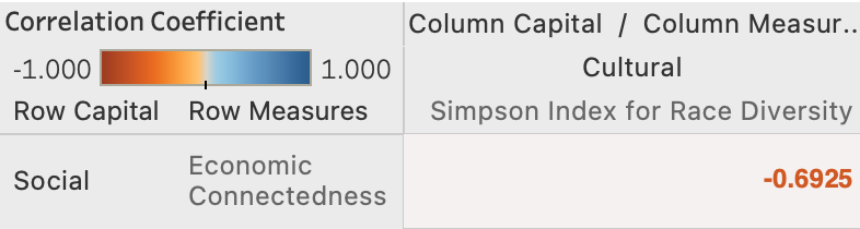 Correlation Between Economic Connectedness and Simpson Index Race Diversity
There is a high negative correlation between economic connectedness and race diversity. We believe this is due to cultural and language barriers. When a community has a higher diversity, it can create a cultural barrier when making friends. This could also be due to homophily social networks, which is when people connect with others that are similar to them which reduces economic connectedness. When there is a high economic connectedness, it can lead to a community having higher living costs. The people and families who have racially diverse backgrounds might have lower incomes which might lead them to move somewhere else. This can cause a lower Simpson Index for race diversity in a community.
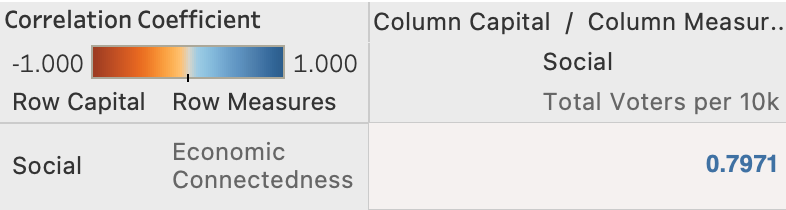 Correlation Between Economic Connectedness and Number of Voters
There is a high correlation between economic connectedness and the number of voters. We believe this could be because economically-connected people may have better education which leads to a greater understanding of politics. Economic connected areas also have a greater access to information, which leads to a greater awareness when it comes to elections, and issues. This leads to people being more informed and engaged when it comes to voting. When there are more people voting in a community there might be more civic organizations and political parties. That can increase the economic connectedness of a community.
Conclusion
Implications for Decision-Makers
Our project provides a foundational framework for decision-makers to:
- Strategically Plan Resource Allocation: Utilize detailed insights from our dashboards to guide the allocation of resources and investment in community capitals.
- Enhance Community Well-being: Implement policies and initiatives that address identified strengths and weaknesses, fostering overall community resilience and sustainability.
Future Work
While our project has achieved significant milestones, there are several areas for future development:
- Expanding Data Sources: Incorporate additional data sources to further enrich the dataset and capture more dimensions of community capitals.
- Advanced Modeling: Develop predictive models to forecast future trends and outcomes based on current data. This could involve using machine learning techniques to identify patterns and make predictions about the impact of changes in community capitals over time.
Acknowledgment
We would like to express our gratitude to our graduate fellow, project advisor, sponsors, and especially our program coordinator, Harun, for their invaluable support and guidance throughout this project. Their expertise and feedback have been instrumental in shaping our approach and helping us achieve our objectives.